

As part of the month-long blogging challenge we have going on over here, I want to be able to provide you with some quality content to start filling your files with (like this great post from yesterday). I don’t want to rely solely on guest bloggers, so I’m going to throw some of my own content in here for ya..with a little tutorial!
I honestly can’t believe *I* am sitting here telling you how to make a blog button. Literally 3 short years ago I wouldn’t even have known what a blog button was. (I barely knew what a blog was then, lol!) But now I love making blog buttons and graphics, it is one of my favorite parts of having a blog! (And waaaay deep down inside, I think I have a little bit of a geeky vein running through me, haha!)
There are a lot of different programs and tutorials out there, but this is what works for me. I hope that it is a help to someone else!
I use Gimp, which is a free program, but kind of tricky to use. It just requires time and effort to learn the many many different aspects of it. I still have a looooong way to go (who knows? I might even be doing it all wrong) but I have learned enough so far to get me by. Here is the Nicole way to make a blog button using Gimp. (Please note that I have only ever used Gimp on a Mac computer, some things may look different on your PC.)
Once you open Gimp (that would be a good place to start, now wouldn’t it?) go to “File” and select “New”

This screen will pop up:

A normal blog button is 125x125 pixels, but feel free to make it any size you want. Once you’ve typed in those numbers, click “ok.” You now have a button.

But lets dress it up, shall we? That blank white box isn’t doing much for me.
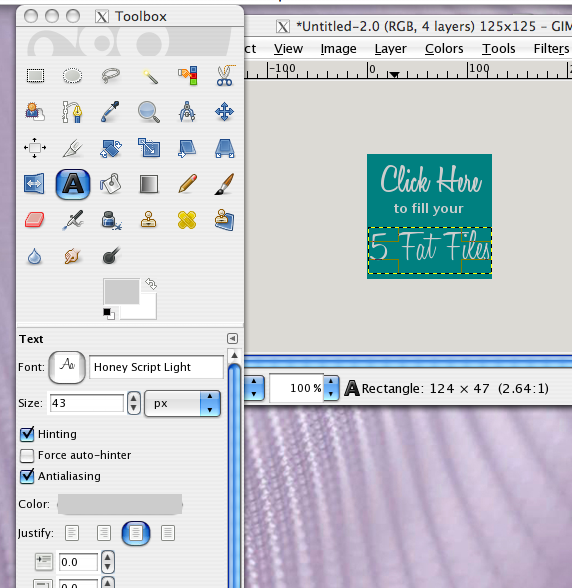
Along with the window that your button is in, the “toolbox” window should be open. This has all the different “tools” we will use to make this button. It looks like this:

Start by clicking the paint can (indicated by the red arrow). This tool is going to fill our button with a color. Pick your color by clicking the black box (blue arrow). You also want to make sure that the “FG color fill” button is selected (green arrow).
When you click the black box, another window will pop up for you to select a color. I picked a nice teal (because teal is the new black, hadn’t you heard?) Select your color and click “ok.”

Now go click on the window that your button is in (to select that window) and hover your mouse over the button. Your mouse will appear as a little paint can. Click on the button, and it will fill with the color you picked!

Now lets add some text to our button. Go back to your “toolbox” window…

Click on the “A” (red arrow) to select the text tool. Next click on the font button (blue arrow) and select the font you want. (I am in love with this Honey Script right now!) Pick a color for your text (green arrow). (Anyone else feel like we are playing "red light, green light?")
Go back to your button window. Click on the button to create a “text box” and just start typing. Your text should appear as you type.

Go back to your “toolbox” window and change the size of the text (green

So far our button only says “Click Here.” That is because I want the different lines of text to be different fonts and sizes. I think that creates more visual interest and also makes it easier to read by breaking it up a little. I just do what looks “right” to me. So, here is the rest of the text process in pictures. I just kept repeating the last few steps to add text, make it the size and font I wanted, and centering it.

 |
| See? I changed the font. |
When you are adding these text layers, there are most likely 3 other windows open. We haven’t needed them up to this point, but now I’d like to explain them:

When you are adding these text layers, there are most likely 3 other windows open. We haven’t needed them up to this point, but now I’d like to explain them:
1. Your text editor. This is where you can edit your text (shocker, I know) like if you spell a word wrong or something.
2. The layers window. Your background and each of your text boxes are all separate layers. More on that in a minute.
3. Your history, in case you want to go back and undo something.
The most important of these is number 2, the layers window. If I want to edit the “click here” text, I must have that layer selected. Otherwise I can’t do anything to it. Maybe I'm just nutso, but I have the hardest time remembering to select the layer I want!

So now that you know about the layers, you can get all the text boxes spaced just the way you want them by clicking the correct layer, and then moving the text box. (If you click on the text box you want, your mouse should come up as a directional arrow when you hover over that text.)

Now we have a basic button. Congratulations! You can stop right here and be good to go….or you can continue and dress your button up a little bit more.
Oh, you want to keep going? I was hoping you’d say that. :)
Lets add a background image to our button. Just go to “File” and then “Open.”

Select any image you want from a file on your computer. Let's use a star, even though it has nothing to do with the 5 Fat Files challenge. Because we can. It will open in a new window.

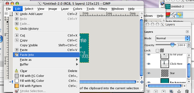
Go to "Edit," click "copy." This copies the image to your clipboard.

Now, this part you must keep straight. It has to do with layers. Listen very carefully.
Click on the window with your button, then click on the layers window. (If you click on the layers window without clicking on your button first, you'll add a new layer to the star instead of the button.) Once you are on the layers window, click the button indicated by the red arrow to add a new layer.

This window will pop up:

You can give your layer a name, if you want to be all fancy like that. Click "ok."
Make sure you select the new layer before going on! Go to "Edit" and click "Paste into." This will paste the star into the new layer (as long as you selected the new layer first!)
Our star is now pasted in, but it is not the right size.

Go to "Layer" and click "Scale Layer."

This window will pop up:

Decide how big you want your image and type that in. Since our button is 125x125 pixels, I went for a little bit smaller than that. Click "Scale."
Once it scales down, you can click on it and drag it where you want it.

Go back to the layers window. You need to "anchor" this layer (I honestly don't know why!). Do that by clicking the anchor button indicated by the blue arrow.

Now make sure that your image is behind your text. (Unless of course, you want it to cover up your text. More power to ya.) Just use the up or down arrows at the bottom of the window to put it underneath your text, but above your background color.

We're just about done! Lets just add a simple border to our button.
Click on "Filters", then "Decor" then "Add Border."

This window will pop up:

Since a button is quite small, we just want a tiny border. I chose 3 pixels. Click on the color box to select your color.
I, quite clearly, chose a brown to match the star.

Click ok, aaaaand, you're done!

Go to "File" to save your button. If you just click "Save" it will save it as a .xcf file, which simply means you can open it back up in Gimp and edit it more. To save it in a permanent format, click "Save As."

This window will pop up: (how many times have I said that in this post???)

Select where on your computer you want to save it. Type the name in the top, followed by a period, followed by the format you wish to save it as. I usually do .jpeg for a button.
Hit save.

Blah, blah, whatever. Just hit "Export."
Then your eyes will be feasting on this:

Just hit "Save." Not sure what all that means either.
And now you are really and totally done!

I know that was a long, long process (and about 42 screen shots - no lie) but once you know those basic things, it really goes a lot quicker. I've tweaked this to make most of the graphics for my site. It is so fun to learn how to do new things!
I honestly just play around with Gimp and click lots of buttons until I get results I want. If I'm not sure what a particular option will do, I just click it and find out. If I'm not sure how wide I want something (like the first time I put a border on something) I just shoot high and whittle it down to where I want it. I figure, I'll get it eventually, and if I don't, I'll ask someone! *CoughAndrewcough*
I hope that this is a help to someone, and that you enjoyed learning something new today! Have you ever tried Gimp? What photo editing software do you typically use? Did I miss any important steps in this process?
Psst! If you have any trouble making your own button, I'd be glad to help you out if I can! Just leave me a comment!

Thank you Nichole!!
ReplyDeleteI have used the GIMP in Slackware & Ubuntu (both are types of Linux).
I have figured out how to scale, crop, and split pictures for wallpaper. But any more than that is just when I have time to play around and see what I can come up with!
So far most of the help for GIMP that I have found online assumes a MUCH higher level of knowledge than I currently possess. =(
So, I was really thrilled with this post!
Thanks again!
Meadow
P.S. I bookmarked this post! =)
Wow, thanks so much! Glad it was a help! I don't find much help with Gimp online, either...I find it is just better to play around with it and learn as I go!
Delete